Friday, September 9, 2011

Connecting to The Yale Center for British Art

Sir Peter Paul Rubens (1577-1640, Flemish), Peace Embracing Plenty, between 1633 and 1634, oil on panel,
24 3/4 x 18 1/2 in. (62.9 x 47 cm),
Yale Center for British Art, Paul Mellon Collection
Photograph: Yale Center for British Art

The Yale Center for British Art celebrates the launch of their new online catalogue in an exhibition entitled Connections. Considered the most comprehensive collection of British Art outside of the United Kingdom, the Center’s holdings include some 2,000 paintings, 200 sculptures, 20,000 drawings and watercolors, and 31,000 prints, 35,000 rare books and manuscripts, an Archive and Reference Library. The entire collection will eventually be accessible through its impressive website, http://britishart.yale.edu. Presently entries for painting, sculpture and the Reference Library are complete; other areas are partially finished. Initial records cover essential information. Digital images in the public domain are included. Details concerning an object’s provenance, exhibition history, bibliography and conservation will be added as the site expands and evolves making possible unparalleled opportunities for online research. It’s free and available to everyone.

Connections stimulates the mind and pleases the eyes. Viewers get a sense of being in a tangible cyberspace where ”clicks” lead to a variety of paths. The exhibit demonstrates physically the extent and diversity of the Center’s collections by exploring different approaches to the meaning of relationships. Ten themed sections look at individual artists, periods, mediums, artists’ movements, genres, styles, history and places. Displays express interdisciplinary ties by juxtaposing paintings, drawings, watercolors, sculptures, books and prints. Topics such as Sporting Art, the Academy and the Human Body, Egypt, British Modernism in the 1930s, Samuel Palmer and the Ancients, and Hogarth and History bring to light fascinating linkages.
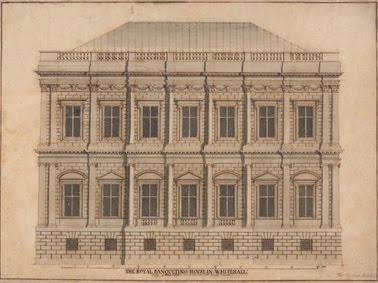
Thomas Forster (ca. 1677-after 1712, British), Banqueting House, Whitehall, undated, pen and brown ink, graphite, gray wash, heightened with white on medium, slightly textured, beige wove paper, sheet: 10 3/8 x 14 in. (26.4 x 35.6 cm),
Yale Center for British Art, Paul Mellon Collection
Photograph: Yale Center for British Art

The segment devoted to British Art in the 1630s is one of my favorites. Here drawings, paintings, books and prints focus on the work, artists and history associated with the Banqueting House at Whitehall. This edifice was part of the royal palace complex designed in 1622 by Indigo Jones for the Stuart monarch James I. It was the first building in England using classical vocabulary and ushered in the modern Italian Renaissance style of architecture.

Attributed to Inigo Jones (1573-1652, British), A Plumed Saddle-Horse, ca. 1640,
pen and brown ink on medium, slightly textured, cream laid paper,
sheet: 5 5/8 x 5 in. (14.3 x 12.7 cm),
Yale Center for British Art, Paul Mellon Collection
Photograph: Yale Center for British Art
t
Inigo Jones (1573-1652, British), Design for a Temporary Arch Ornamented with Putti and Allegorical Figures of Music and War, ca. 1622,
pen and brown ink and brown wash; verso: graphite on medium, slightly textured, cream laid paper, sheet: 9 1/2 x 6 3/4 inches (24.1 x 17.1 cm),
Yale Center for British Art, Paul Mellon Collection
Photograph: Yale Center for British Art

Royal ceremonies, receptions and entertainments called masques that combined theatre, music, dancing, elaborate scenery and costumes took place at the Banqueting House. Stage sets and other elements for these festivities were often devised by prominent architects like Jones.

James I was succeeded by his son Charles I who commissioned the Flemish artist Peter Paul Rubens to paint the Banqueting House’s ceiling glorifying his father and the Stuart reign.

Simon Gribelin (1662-1733, French, active in Britain), after Sir Peter Paul Rubens (1577-1640, Flemish), From the Painting of the Ceiling in the Banqueting House at White-Hall in the Year 1720, ca. 1720, line engraving on medium, slightly textured, cream laid paper,
3 sheets pasted together,
sheet (cropped inside plate): 37 3/4 x 18 1/2 in. (95.9 x 47 cm),
image: 36 3/8 x 18 1/8 in. (92.4 x 46 cm),
Yale Center for British Art, Paul Mellon Collection
Photograph: Yale Center for British Art

The king wanted Rubens to stay and work for him but the painter went back home to Antwerp. He left his pupil Anthony van Dyck to satisfy the monarch’s plans. Van Dyck thereafter became principal court painter. In 1649, Banqueting House was also the scene of Charles I’s execution. The king probably walked through one of the hall’s windows onto a platform erected on the building’s north end for his beheading. The building is the only structure remaining of the old palace.

Historical events, artworks, architecture, artists, architects, printmakers, spectacles, societal events, patronage and the role and status of artists are some of the subjects considered in this area. The artifacts on display pack a wallop of mental activity.

Josiah Wedgwood (1730-1795, British) and Thomas Bentley (1731-1780, British) after George Stubbs (1724-1806, British), Horse Frightened by a Lion (Episode A),
modelled 1780, solid blue jasper with white relief, shallow oval,
frame: 14 5/8 x 14 1/4 in. (37.1 x 36.2 cm),
image (oval): 10 x 16 in. (25.4 x 40.6 cm),
Yale Center for British Art, Paul Mellon Collection
Photograph: Yale Center for British Art

The section on George Stubbs also enthralls making apparent the scope of this artist’s achievements. There is much of merit to take in but of special note is a Wedgwood relief, enamel paintings and rarely exhibited human figure and animal drawings.

George Stubbs (1724-1806, British), A Comparative Anatomical Exposition of the Structure of the Human Body with that of a Tiger and a Common Fowl: Human Figure, Lateral View, Undissected (Finished Study for Table VIII),
between 1795 and 1806, graphite on moderately thick, slightly textured, cream wove paper,
sheet: 21 1/4 x 16 in. (54 x 40.6 cm),
Yale Center for British Art, Paul Mellon Collection
Photograph: Yale Center for British Art
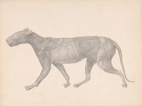
George Stubbs (1724-1806, British), A Comparative Anatomical Exposition of the Structure of the Human Body with that of a Tiger and a Common Fowl: Tiger, Lateral View, with Skin and Tissue Removed (Finished Study for Table IX),
between 1795 and 1806, graphite on moderately thick, slightly textured, cream wove paper, 
sheet: 16 x 21 1/4 in. (40.6 x 54 cm),
Yale Center for British Art, Paul Mellon Collection
Photograph: Yale Center for British Art

George Stubbs (1724-1806, British), A Comparative Anatomical Exposition of the Structure of the Human Body with that of a Tiger and a Common Fowl: Fowl, Lateral View with Most Feathers Removed (Finished Study for Table X), between 1795 and 1806, graphite on moderately thick, slightly textured, cream wove paper, with a strip of same wove paper joined to bottom edge,
sheet: 22 1/4 x 16 in. (56.5 x 40.6 cm),
Yale Center for British Art, Paul Mellon Collection
Photograph: Yale Center for British Art

In the gallery devoted to Thomas Gainsborough, the artist came alive as I read the letter he wrote to his friend William Jackson, composer, essayist and organist of Exeter Cathedral (letter, 1773 Jan. 29, Rare Books and Manuscripts Collection). In his clear script, the artist precisely discloses his methodology for making chalk drawings look like oil paintings. His words make evident the two men’s close friendship. Also on view is a beautiful portrait of a young women. She has been called the "Mona Lisa of British Art" because of her smile and expression.

Thomas Gainsborough (1727-1788, British), Portrait of a Woman, ca. 1750,
oil on canvas, 29 7/8 x 26 1/4 inches (75.9 x 66.7 cm)
Yale Center for British Art, Paul Mellon Collection
Photograph: Yale Center for British Art

The last two rooms introduces visitors to the Seven & Five Society, an early twentieth-century art group whose artist members sought to combine modernity with Britishness. As the Society evolved, the group’s intention became experimental and abstract. Among the members were Henry Moore, John Piper, Ben Nicholson and Barbara Hepworth. Examples of their work are installed admirably for easy comparison.

Although the show may lack what is considered great masterpieces, it offers much that educates and delights. For those who can not make it to New Haven, go to the Center’s “user friendly” website and experiment with their online catalogue. There are many options to begin searches, various ways to narrow and refine results, mix filters or widen inquires. The database is a work in progress. Advance capabilities lie ahead


May 20, 2011–September 11, 2011
1080 Chapel Street
New Haven, Connecticut
Tuesday – Saturday, 10 am to 5 pm
Sunday, noon to 5 pm
Closed Mondays and holidays

Sunday, August 28, 2011

The Amazing Popularity of Alexander McQueen


Alexander McQueen (British, 1969–2010), Dress, Voss, spring/summer 2001,
Razor-clam shells stripped and varnished
Courtesy of Alexander McQueen
Photograph © Sølve Sundsbø / Art + Commerce

The Metropolitan Museum of Art’s Costume Institute exhibition, “Alexander McQueen: Savage Beauty”, was the eighth most popular exhibit in the Met’s 141-year-old history and the Costume Institute’s most attended. Its closing date was extended twice, special fee viewing hours were established on Mondays when the museum is usually closed and, for the first time, the Met remained open until midnight on the show’s last two days.


Alexander McQueen (British, 1969–2010), House of Givenchy Haute Couture
,
Ensemble, Eclect Dissect, autumn/winter 1997–98,

Dress of black leather; collar of red pheasant feathers and resin vulture skulls; gloves of black leather
Courtesy of Givenchy Haute Couture

Photograph © Sølve Sundsbø / Art + Commerce

From the public opening on May 4 to its closing on August 7, some 661,509 visitors swarmed the show. There were long lines with many waiting more than 5 hours to see the display - more reminiscent of a rock concert than a museum visit. I would venture that a good percentage of visitors had never heard of the designer until the April royal wedding of Prince William to Kate Middleton. Kate’s wedding gown and shoes were designed by the creative director of Alexander McQueen, Sarah Burton and her team. Ms. Burton had worked side by side with the designer for 14 years. Possibly, Alexander McQueen’s suicide last year at the age of 40 aroused the curiosity of some attendees. He hanged himself in the wardrobe of his tony Mayfair apartment after taking a significant amount of drugs and slashing his wrists.  Regardless, the people came in unexpected numbers and the museum made money surely needed. One estimate is that the Met made a minimum of $14.6 million in revenue (see Jenna Sauers, How Much Did The Met Make Off The Alexander McQueen Show, Jezebel, August 9, 2011).

The fashion conscious obviously knew about the designer. McQueen had married the rigors of classic tailoring with the playfulness of couture dressing using unconventional material. His couture expressed a blend of contrary concepts such light and dark, nature and technology, life and death, beautiful and grotesque. He won the coveted British Designer of the Year award four times; was named the Council of Fashion Designers’ International Designer of the Year in 2003; and, was honored as a BCE, Commander of the Order of the British Empire.


Alexander McQueen (British, 1969–2010), Dress, No. 13, spring/summer 1999,

White cotton muslin spray-painted black and yellow with underskirt of white synthetic tulle

Courtesy of Alexander McQueen

Photograph © Sølve Sundsbø / Art + Commerce

McQueen’s catwalk presentations were frequently off-putting yet mesmerizing. Comparable to theatre or performance art, his shows were compelling. McQueen had said (Harper’s Bazaar, US, April 2007), “I find beauty in the grotesque, like most artists.  I have to force people to look at things.”  He did.

In one presentation, two commercial robots firing black and yellow paint at a model’s voluminous white dress as she spun slowly in circles on a turntable attempting to protect herself from the robots’ shots in apparent fright (spring/summer 1999). In another, mussed up, distraught-looking models, many with breasts and bottoms exposed, teetered down the runway in torn garments (autumn/winter 1995-1996). One show had a model’s elbows and knees constrained by manacles crippling her catwalk (spring/summer 1997). Once he ended a presentation with a model surrounded by a ring of fire (fall/winter 1998).  At an earlier show, he had his models thoroughly soaked in a shower of golden rain (spring/summer 1998). 


Alexander McQueen (British, 1969–2010), Runway Show,
Untitled, spring/summer 1998
Photo source tumblr
Video source YouTube

Go to  http://blog.metmuseum.org/alexandermcqueen/video/  for highlights from some of McQueen's 1997-2010 runway shows.

The “Alexander McQueen: Savage Beauty” exhibit captured McQueen’s sense of the theatrical. Andrew Bolton, a curator of the Met’s Costume Institute, worked with Sam Gainsbury and Joseph Bennett, production designers for Alexander McQueen’s fashion shows, to curate the extravaganza. They installed 100 garments and 70 accessories in a variety of settings using dramatic lighting, holographic, film and video visuals, music and sounds. Most of the garments were from the Alexander McQueen Archive in London but some were privately lent. The show was organized around the theme of McQueen’s romantic mind. Wall surfaces were differentiated to reflect an aspect of his romanticism. For example, the “Romantic Gothic” gallery, which referred to the designer’s focus on Victorian gothic, was lined with aged mirrors.


“Alexander McQueen: Savage Beauty” Gallery View, Romantic Nationalism, 
The Metropolitan Museum of Art, 2011
Photo: The Photograph Studio, The Metropolitan Museum of Art

The space for “Romantic Nationalism”, McQueen’s take on his Scottish and British heritage, used marquetry as a background.


“Alexander McQueen: Savage Beauty” Gallery View, Romantic Exoticism,
The Metropolitan Museum of Art, 2011
Photo: The Photograph Studio, The Metropolitan Museum of Art

The “Romantic Exoticism” space, which held clothes influenced by other cultures, evoked a music box with rotating mannequins in bright mirrored vitrines.  “Romantic Primitivism” gallery, which related to McQueen’s take on the noble savage, used rusty metal enclosures and inspired thoughts of a sunken ship. Enhancing this effect was an overhead film projection of a young model sinking into deep water, her limbs entangled in seaweed-like chiffon. “Romantic Naturalism” room, containing designs derived from nature’s forms and materials, was covered in wall paper based on a blow-up of a McQueen drawing.


“Alexander McQueen: Savage Beauty” Gallery View, Cabinet of Curiosities,
The Metropolitan Museum of Art, 2011
Photo: The Photograph Studio, The Metropolitan Museum of Art

In the “Cabinet of Curiosities” gallery, meant to emulate 18th and 19th-century collector cabinets filled with a variety of objects, an assortment of wall mounts housed accessories - shoes, headdresses and jewelry. Monitors placed up high presented an on-going loop of past McQueen runway shows. The holographic projection of the model Kate Moss (fall/winter 1996) was seen in a smaller room.


Kate Moss Hologram, from “Alexander McQueen:  Savage Beauty”, 
The Metropolitan Museum of Art, 2011
Video source YouTube

Nearby was a variation of the gown Moss wore, a gorgeous garment made up of hundreds of layers of raw-edged silk organza.  People struggled to see the hologram but no one took notice of the actual gown. The final room of the exhibition, covered in acrylic tiles like a clinical lab, held some of the designer’s last creations.


Alexander McQueen (British, 1969–2010),
“Jellyfish” Ensemble, Plato’s Atlantis, spring/summer 2010,
 
Dress, leggings, and “Armadillo” boots embroidered with iridescent enamel paillettes

Courtesy of Alexander McQueen

Photograph © Sølve Sundsbø / Art + Commerce

I commend Bolton and his team for their inventive display. This was museum experience as spectacular entertainment with the feel of a funhouse or carnival. Although it had much appeal as the attendance figures affirm, an important learning opportunity was missed. There was no probing under the surface of the show. I would have liked to see McQueen’s designs put in a social, cultural or art historical contact with expertise from a costume or textile specialist. This viewer wanted to know more and, in many instances, found it difficult to even find or read the show’s descriptive labels.

I am perfectly aware of the need to rethink the traditional museum exhibition (see ArtWithHillary, The Spectacular Design of The Red and White Quilt Show, April 15, 2011) but this must be accomplished without a loss of meaning and critical thought.

I have similar issues with the museum’s exhibition catalogue. The book juxtaposes McQueen quotes printed in large type with fashion photographs. To find details or references about the clothing, citations and notes, readers must turn to the end pages. This is not an easy task due to the book’s heft, proportions as well as font pattern, typeface size and ink color. Although the catalogue includes a preface by Andrew Bolton explicating the exhibition’s premise and execution, an introductory biographic essay by Susannah Frankel, fashion editor for The Independent and an interview with Sarah Burton by the fashion writer Tim Blanks, it is basically a picture book . This was no scholarly tome.

The fashion photographer Sølve Sundsbø, known for his digital altered prints, was responsible for the imagery. Live models were made to look like inanimate mannequins by painting their skin white, articulating their joints with string, and removing their heads from the final shot. Many photographs had imaginative cropping but this reader could not help but wish for a more straight forward presentation.

Eyebrows have been raised about the cozy relationships between donors and exhibits since the Guggenheim Museum held a Giorgio Armani show in 2000 after a major contribution by the designer. Alexander McQueen supplied the major funding for the Met’s exhibition. Keeping this in mind, such endeavors are still worthwhile if done with good judgement. Since fashion has been recognized as art which warrants major museums’ attention, criteria on par with other curatorial undertakings should be applied. Put dress in the context of history, culture and other disciplines. Look inside, outside and beyond the clothes. Treat fashion as any other artistic masterwork. Meanwhile, the definitive Alexander McQueen exhibit and study has yet to be done.


The Metropolitan Museum of Art, Friday, August 5, 2011, 
Photo by Ramsay de Give for The Wall Street Journal

Saturday, July 23, 2011

A Radiant Masterpiece Reveals More: Part 2

Giovanni Bellini, Detail of St. Francis in the Desert, c. 1480,
oil on poplar panel, 49 x 55 7⁄8 in. (124.5 x 141.9 cm),
The Frick Collection, New York
Photo: Michael Bodycomb

The following is a continuation of the June blog post, A Radiant Masterpiece Reveals More - Part 1. The discourse considers The Frick Collection’s St. Francis in the Desert by Giovanni Bellini and the discoveries made last year during the painting’s five week technical analysis at the Conservation Center of The Metropolitan Museum of Art. This is also the subject of The Frick’s present exhibition, In a New Light: Bellini's St. Francis in the Desert.

Giovanni Bellini, St. Francis in the Desert, c. 1480,
oil on poplar panel, 49 x 55 7⁄8 in. (124.5 x 141.9 cm),
The Frick Collection, New York
Photo: Michael Bodycomb

Although the recent examination of Giovanni Bellini’s St. Francis in the Desert disclosed much that was new, the painting still remains an enigma. The study confirmed that the panel was in excellent condition and needed only surface cleaning to remove dust. Through infrared reflectography, it revealed Bellini’s previously concealed underdrawing. Since very few drawings, preparatory or otherwise, can be attributed to the artist, the uncovering of such designs is particularly important. Comparison between the underdrawing and painting that hid it, makes apparent the small as well as the noteworthy changes Bellini made to achieve the work’s final realization.

Giovanni Bellini, Infrared reflectogram detail of St. Francis in the Desert,
c. 1480, oil on poplar panel, 49 x 55 7⁄8 in. (124.5 x 141.9 cm),
The Frick Collection, New York,
Technical photography by Department of Paintings Conservation,
The Metropolitan Museum of Art Image © The Metropolitan Museum of Art

We see that at times the artist’s painted layers followed closely what was drawn such as in the rendering of the saint’s head and face. Mouth open, eyes searching upward, Francis expresses awe, surprise, ecstasy or a combination of these. For the drawing, the artist employed a variety of brushstrokes to create remarkable three-dimensionality. Thick or fine lines describe contours; hatching is used for modeling; and, a combination of hatching and crosshatching situate items in space. In some areas of the panel, Bellini made minor modifications as seen in the elimination of a door or chimney on a background edifice. In other instances, refinements made aesthetic sense such as the widening of the saint’s right sleeve.

Giovanni Bellini, Infrared reflectogram detail of St. Francis in the Desert,
c. 1480, oil on poplar panel, 49 x 55 7⁄8 in. (124.5 x 141.9 cm),
The Frick Collection, New York,
Technical photography by Department of Paintings Conservation,
The Metropolitan Museum of Art Image © The Metropolitan Museum of Art

Giovanni Bellini, Detail of St. Francis in the Desert, c. 1480,
oil on poplar panel, 49 x 55 7⁄8 in. (124.5 x 141.9 cm),
The Frick Collection, New York
Photo: Michael Bodycomb

At times the artist choose to redesign more. He transformed the background footbridge from a simple post-and-lintel type of construction which extended to the right bank into a more complex arch and vault bridge system that ended behind the shore edge. Moreover, during painting, Bellini added a back flat shelf to the slanting reading surface of the saint’s desk. On this he painted a cross with a crown of thorns and a skull.

The painting shows the moments after Francis was interrupted from his contemplation of the Passion of Christ - the final hours of Jesus’ life according to the New Testament. There is a bookmark to indicate the page where he stopped reading. His sandals are left in the enclosure when he hurriedly stepped outside on ground that may be perceived as holy. It is dawn and all is still. The lighting, more theatrical than real, is twofold - natural and sacred. The heavenly rays fall from the upper left of the sky onto Francis. The temporal morning light shines on the middle and far ground. In the distance, a shepherd and his flock look toward the saint as if to see what is happening.

Giovanni Bellini, Detail of St. Francis in the Desert, c. 1480,
oil on poplar panel, 49 x 55 7⁄8 in. (124.5 x 141.9 cm),
The Frick Collection, New York
Photo: ARTstor

A rabbit in the foreground comes out of his dark burrow to peer at the saint and the source of the supernatural beams. The painting is filled with flora and fauna. All are identifiable attesting to Bellini’s keen observation of the world. In fact, a botanist was brought to see the work and was able to describe each plant portrayed.

From the swaying, tall laurel tree on the left to the the small kingfisher bird under the water spout at the lower right, everything has meaning. The grapevine over the saint’s shelter evokes Christ as “the true vine” according to the Gospel of John 15. The laurel, whose leaves remain green all year, symbolizes triumph, eternity and the resurrection of Christ. The shepherd’s ram, as a leader of the herd, is another reference to Christ. The rabbit who needs protection alludes to those who hope for salvation through Christ in addition to denoting fertility and lust. The kingfisher, long a good omen, is associated with peace and prosperity. Even the spout protruding from the rocks is linked to the fountain of Muses in Greek mythology and thought to be a symbolic representation of imagination - as water flows through a spigot, imagination passes through the mind. Not incidentally, Bellini paints this detail not far from his signature.

Giovanni Bellini, Detail of St. Francis in the Desert, c. 1480,
oil on poplar panel, 49 x 55 7⁄8 in. (124.5 x 141.9 cm),
The Frick Collection, New York
Photo: ARTstor

This brings to mind the meaning of the rabbit placed quite close to the saint’s right hand. Tucked into the cord around Francis’ waist is what looks like a folded piece of paper or parchment. It has been postulated that this is a depiction of the piece of parchment,(the original now kept as a relic in the Church of St. Francis at Assisi), on which Francis wrote a hymn to God as well as a benediction to Brother Leo. Along with the writing, the saint drew on it a cross and skull, similar to the cross and skull on the cloister desk. Legend has it that Francis told Leo to keep the parchment as protection against temptation. Could it be used to prevent the lure of concupiscence symbolized by the nearby rabbit? Bellini was a meticulous thinker and planner, what he put in a painting has signification.

As noted earlier, theories and interpretations about the painting are numerous. Some hold it was created for a church; others maintain it was made for a private patron. One hypothesis proposes the lighting in the painting echoes the natural light entering the church or chapel of its intended location. Others have posited the work relates to the Renaissance argument concerning the merits of painting versus poetry - which of the arts can best reproduce reality and express emotion. The work has been connected to Italian pastoral or popular devotional poetry. There is even the opinion that the saint is singing! The abundance of explications can lead to confusion. For me, the strongest argument comes from scholars who interpret the painting as a devotional image, conceived for religious contemplation. It facilitates mediation, stimulates conversation and, encourages the exchange of ideas. I regard it not as descriptive of a specific narrative but as an open-ended, thought-inspiring work. Regardless of explanations, Bellini’s visual creativity never wanes. Take the small, golden tassel protruding from the bottom pages of the saint’s closed book or the tiny, exquisite knot on the string attached to the cloister’s bell made surely to ease the saint’s grip when he rang the bell to signal the canonical hours. These captivating depictions are nearly impossible to see in reproductions. They require and reward attentive viewing of the actual painting. To look this way, makes perceptible passages of delight.

Gerard David, The Disposition, c. 1495-1500,
oil on linen (mounted on mahogany panel),
56 1/8 x 44 1/4 in. (142.5 x 112.4 cm),
The Frick Collection, New York
Photo: ARTstor

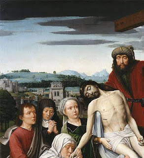
Let us return to the Living Hall and the space the St. Francis usually occupies. In its place is The Disposition by the Netherlandish painter, Gerard David (c. 1460-1523). The scene is Christ’s removal from the cross after His death. Joseph of Arimathea, who received permission to remove the body, is seen with Christ’s other followers along with the Virgin Mary, St. John the Evangelist and Mary Magdalene. The work was acquired by Frick the same year, in the same lot and from same collector as Bellini’s St. Francis.

Gerard David, Detail of The Disposition, c. 1495-1500,
oil on linen (mounted on mahogany panel),
56 1/8 x 44 1/4 in. (142.5 x 112.4 cm),
The Frick Collection, New York
Photo: ARTstor

Gerard David, Detail of The Disposition, c. 1495-1500,
oil on linen (mounted on mahogany panel),
56 1/8 x 44 1/4 in. (142.5 x 112.4 cm),
The Frick Collection, New York
Photo: ARTstor

Although The Disposition was painted about a century after the St. Francis, like the earlier work, the background contains a careful and precise naturalistic townscape with a variety of finely delineated structures. There are castles, towers, fortified walls, a church and windmill. Frick is known to have had a predilection for landscape paintings and this may account for his attraction to the work. Furthermore, there is a prominent skull at the foot of the cross. Although the skull denotes Calvary, the site of the Crucifixion, it has also long been a symbol of the transitory nature of earthly life, a reminder of mortality. Perhaps, in his late sixties, Frick had thoughts of his own end. Whatever the reasons for the purchase, we are lucky to have the David and, of course, the Bellini in New York for us to enjoy.

Note: The Frick has opened a Multimedia Room off to one side of the Garden Court where visitors may view videos on specific aspects of Bellini’s St. Francis in the Desert and look closely at the infrared photograph of the work’s underdrawing. The videos and related lectures are accessible on the museum’s Web site along with a link to the painting's Google Art Project gigapixal image. Susannah Rutherglen, The Frick's Andrew W. Mellon Curatorial Fellow, is responsible for the coordination of this extraordinary exhibit and deserves much acclaim.

In a New Light: Bellini's St. Francis in the Desert
May 22, 2011, through August 28, 2011
1 East 70th Street, Manhattan

Tuesday through Saturday, 10:00 a.m. to 6:00 p.m.
Sundays, 11:00 a.m. to 5:00 p.m.
Closed Mondays and holidays

Thursday, June 30, 2011

A Radiant Masterpiece Reveals More: Part 1


Giovanni Bellini, St. Francis in the Desert, c. 1480,
oil on poplar panel, 49 x 55 7⁄8 in. (124.5 x 141.9 cm),
Photo: Michael Bodycomb

The Frick Collection’s St. Francis in the Desert by Giovanni Bellini was sent for technical analysis in March, 2010 to the Sherman Fairchild Paintings Conservation Center of The Metropolitan Museum of Art. This was the first time the work left the museum since it was purchased in 1915. Like other pictures acquired by Henry Clay Frick (1849 - 1919), it can never be loaned.

The work has always been in very good condition but advanced forms of physical analysis presented the opportunity to significantly increase the understanding of Bellini’s working methods and offer clues to the interpretation of the painting. Scholars have long debated its meaning because Bellini’s depiction of St. Francis’ stigmatization is like no other in the history of art. There is even the question if the work indeed describes the saint receiving the stigmata. Art historians have generally entitled the painting St. Francis in Ecstasy.

In a New Light: Bellini's St. Francis in the Desert, The Frick’s current exhibition, presents the results of The Metropolitan Museum’s examination. For the duration of the show, the painting has been moved from the Living Hall, where Frick had placed it, to the Oval Room. This skylighted gallery provides a light-filled space and seating which gives visitors a comfortable place for contemplation. To further enhance viewing, the painting is installed at a height lower than its usual position.

In order to adequately discuss the new information about the painting, I have divided my blog essay into two parts. The first part will deal with the painter, his milieu, the painting’s history, the subject matter, working methods, and some of the recent discoveries. The second part will focus on additional revelations, treatment of the work and its connection to another Frick Collection painting.

We begin.

The St. Francis in the Desert is one of the most beloved pictures in The Frick and is considered by many to be the best Renaissance painting in America. It was one of Henry Clay Frick’s five favorite works. For those interested, the others were: Rembrandt’s Self-Portrait and Polish Rider, Holbein’s Sir Thomas More and Vermeer’s Mistress and Maid.

Frick preferred portraits and landscapes. He had little interest in religious scenes which is not surprising as he was a Protestant. His tastes were actually typical of American collectors of the period. The St. Francis, actually, may be viewed as a landscape painting. The saint and his humble makeshift cloister take up less than one quarter of the work’s surface. The painting is dominated by a precise, botanically correct, depiction of nature with a background townscape that is one of the earliest, if not the first, naturalistic cityscape depiction in Western art. It is easy to overlook that a miracle has or is occurring.

The painter, Giovanni Bellini (c. 1430 - 1516), is regarded as the artist who brought Venice to the High Renaissance. Visiting the city for the second time in 1506, Albrecht Dürer, described him as the best painter there. Bellini came from an eminent family of painters. He began his career in the studio of his father, Jacopo Bellini. Jacopo was known for extraordinary inventive works and was considered at that time, Venice’s most important painter. Giovanni Bellini’s older brother, Gentile, was held in such esteem that the Venetian Republic sent him to the Ottoman Court of Constantinople as their visiting painter. Bellini’s cousin Leonardo Bellini excelled in manuscript illumination. His brother-in-law was Andrea Mantegna whose figurative style and spatial illusionism surpassed all peers. Mantegna had an enormous influence on Bellini’s development.

In early fifteenth-century Venice, egg tempera was the painting method of choice. This is a quick-drying paint requiring meticulous preparation. Bellini trained in his father’s workshop with this technique. During this period, oil was a fairly original way of painting used primarily by Netherlandish and Flemish artists. As a slow-drying medium, oil allowed for many effects in rendering forms realistically and was capable of producing brilliant colors. Bellini, aware of the northern artists' achievements, learned more from the Sicilian painter Antonello da Messina who was in Venice from 1475 to 1476. Antonello’s proficiency has been attributed to his contact with Flemish artists visiting Sicily and his scrutiny of a work by Jan van Eyck which he saw in Naples. Be that as it may, Bellini took to this method, exploited its potential and created a style characterized by formal clarity, fervor for details and a vision saturated with light. He is credited with having a key role in changing the predominant painting medium in Venice from egg tempera to oil. This, of course, had wondrous repercussions, especially on Bellini’s students, Titian and Giorgione.

The Frick St. Francis was painted entirely in oil. Little is known about the work’s origins. Such questions as “Why it was painted?”, “For whom it was painted?”, “Where was it initially located?”, have not been answered. We know that it was in a private collection in a Venetian home some forty to fifty years after completion. Historians have suggested that the painting may have been intended for a chapel on a monastic island associated with St. Francis but no document has been found to confirm its earliest provenance.

St. Francis, a thirteenth-century saint, was enormously popular in Venice. He was the son of a wealthy cloth merchant, who renounced his worldly life after receiving a vision. He lived a life of poverty, preached the Gospel in Italy and overseas, and founded the Franciscan Order. He was the first person to receive the stigmata, Christ’s five crucifixion wounds symbolizing the divine’s recognition of steadfast faith. This momentous event took place in 1224 during the saint’s fast on the Tuscan mountain of La Verna. His follower, Brother Leo, had accompanied him and witnessed the stigmatization. Leo described Christ in the form of a fiery seraph, one of the angelic higher orders, with six wings who flew on a cross transmitting the wounds to St. Francis.

Paintings that depict St. Francis usually represent him kneeling while receiving the stigmata via rays sent forth from a airborne seraph on a crucifix. The beams pierce his hands, feet and side. Some scholars have hypothesized that The Frick St. Francis may have had a seraph painted in the upper part of the painting but was lost when the work was cut down. Analysis, however, determined only a few centimeters were removed from the top panel. Considered too small an amount to have contained figures, it was concluded the seraph most likely was never there. Further technical study using high magnification, microscopic examination, X-rays, infrared reflectography, paint analysis, surface inspection and study/discussions by conservators, art historians, scientists and educators revealed more.

X-rays established that Bellini used three horizontal poplar panels as the painting’s support. These were prepared with a gesso ground made from gypsum and animal glue. Bellini then carefully delineated an underdrawing using fluid, carbon-based black paint. In a few places he incised the drawing with the reverse end of his brush, such as in the shadow of the saint. After the underdrawing dried, assistants spread a preliminary layer of oil mixed with a little lead white. This mixture produced a bright reflective surface that did not obscure the underdrawing. It had several functions: it imparted luminosity to the overlying paint and gave the effect of light seeming to emanate from the painting’s interior; it acted as a sealant for the underlying drawing; and, it insulated the painting by preventing the oil paint’s seepage into the porous ground below. Since the oil/lead white layer was smoothed by hand, paint loss has now exposed finger and palm prints in certain areas. None were Bellini's.


Giovanni Bellini, Detail of St. Francis in the Desert, c. 1480,
oil on poplar panel, 49 x 55 7⁄8 in. (124.5 x 141.9 cm),
Photo: Michael Bodycomb

The question of whether the saint had stigmata was long debated. Some people thought the stigmata on his hands were a nineteenth-century addition. The stigma on his foot is not visible to the unaided eye. During The Metropolitan Museum’s study, an infrared reflectogram produced a black-and-white clear image of Bellini’s underdrawing. For the first time, scholars could study the artist’s preparatory composition. It distinctly showed that the stigmata on the saint’s hands and the stigma on his left foot were originally depicted. In addition, residue of red paint on the foot was discerned using high magnification. The paint had worn away but the wound mark had certainly been indicated by the artist.

Bellini choose not to depict St. Francis in the conventional manner. The saint has no side wound. He is marked only on his hands and left foot. Brother Leo, who is typically present, is not there. In fact, the stigmatization seems not to be the most important meaning of the painting. Additional analysis provides further clarification. For now, however, visit the painting. My next post will tell more.

In a New Light: Bellini's St. Francis in the Desert

May 22, 2011, through August 28, 2011
1 East 70th Street, Manhattan

Tuesday through Saturday, 10:00 a.m. to 6:00 p.m.
Sundays, 11:00 a.m. to 5:00 p.m.
Closed Mondays and holidays

Saturday, May 21, 2011

A Fred and Ginger of the Art World:  Sol LeWitt and Eva Hesse


Eva Hesse,
Accession V, 1968, 
galvanized steel and rubber, 10 x 10 x 10 in. (25.4 x 25.4 x 25.4 cm),
Courtesy of the Craig F. Starr Gallery, New York


Sol LeWitt,
3 × 3 × 3, 1965,
painted wood, 14 1⁄2 x 14 1⁄2 × 14 1⁄2 in. (36.8 x 36.8 x 36.8 cm),
signed and dated underneath: ‘Sol LeWitt 1965’,
Courtesy of Craig F. Starr Gallery, New York


Eva Hesse and Sol LeWitt, a museum-worthy exhibit, is now on view at the Craig F. Starr Gallery. Rather than stressing the artists’ differences, the show highlights their mutual influences especially the impact Hesse had on LeWitt. I can think of no exhibition in the past that has shown the longterm effect Hesse’s art had on the work of LeWitt.

Veronica Roberts, Director of Research for the Sol LeWitt Wall Drawing Catalogue Raisonné and Adjunct Associate Curator of Contemporary Art at the Indianapolis Museum of Art, curated the show and wrote the essay for the exhibition’s catalogue. Roberts has done an inspiring job in the choice of works and their placement which illuminates each artist's achievement in an informal, intimate manner.

LeWitt met Hesse in 1960 and remained friends until her death ten years later. They were part of a group of artists working in lower Manhattan who formed strong bonds while creating new stylistic movements.

LeWitt had much confidence in Hesse's abilities while she suffered with insecurities and anxieties. The exhibition includes a reproduction of a letter LeWitt wrote to Hesse in 1965 when she was in Germany for a fourteen month residency with her husband Tom Doyle. He urged her to “DO” her art and offered strong support and insight into her struggles. He wrote, “Well, you know I admire your work greatly and can’t understand why you are so bothered by it.” LeWitt continued, ”You also must believe in your ability.”  Further he encouraged, “You have at your power the ability to do anything.” Such was his friendship and caring.

Hesse took the minimalist ideas further and evolved what is referred to as a post-minimalism style. The austere, modular, geometric forms of such artists as LeWitt were transformed into something personal and anti-form.   Her work was sensual, erotically charged with illusions to the human body.  LeWitt responded. The teacher/mentor was taught by the pupil. His artwork changed.


Sol LeWitt, 
Horizontal Brushstrokes (More or Less), 2002,
gouache on paper, 22 3/8 x 22 3/8 in. (56.8 x 56.8 cm),
signed and dated lower right: ‘S LeWitt 02’,
Courtesy of the Craig F. Starr Gallery, New York


Eva Hesse,
No title, 1966,
enamel, cord, papier-caché, latex, and rubber,
47 x 11 1⁄2 x 2 1⁄2 in. (119.4 x 29.2 x 6.4 cm),
Courtesy of Craig F. Starr Gallery, New York


To paraphrase what is often said of the Fred Astaire and Ginger Rogers partnership, one can say LeWitt gave Hesse classic structure and she gave him sexuality. Frank Gehry understood such relationships when he designed the Fred and Ginger building in Prague.

Frank Gehry, Fred and Ginger House, 1992-1996,
Prague, Czeck Republic

Don't miss the Hesse and LeWitt show.

Eva Hesse and Sol LeWitt
April 12 - May 27
5 East 73rd Street, Manhattan
Tuesday - Saturday
 11 am to 5:30 pm