Saturday, July 23, 2011

A Radiant Masterpiece Reveals More: Part 2

Giovanni Bellini, Detail of St. Francis in the Desert, c. 1480,
oil on poplar panel, 49 x 55 7⁄8 in. (124.5 x 141.9 cm),
The Frick Collection, New York
Photo: Michael Bodycomb

The following is a continuation of the June blog post, A Radiant Masterpiece Reveals More - Part 1. The discourse considers The Frick Collection’s St. Francis in the Desert by Giovanni Bellini and the discoveries made last year during the painting’s five week technical analysis at the Conservation Center of The Metropolitan Museum of Art. This is also the subject of The Frick’s present exhibition, In a New Light: Bellini's St. Francis in the Desert.

Giovanni Bellini, St. Francis in the Desert, c. 1480,
oil on poplar panel, 49 x 55 7⁄8 in. (124.5 x 141.9 cm),
The Frick Collection, New York
Photo: Michael Bodycomb

Although the recent examination of Giovanni Bellini’s St. Francis in the Desert disclosed much that was new, the painting still remains an enigma. The study confirmed that the panel was in excellent condition and needed only surface cleaning to remove dust. Through infrared reflectography, it revealed Bellini’s previously concealed underdrawing. Since very few drawings, preparatory or otherwise, can be attributed to the artist, the uncovering of such designs is particularly important. Comparison between the underdrawing and painting that hid it, makes apparent the small as well as the noteworthy changes Bellini made to achieve the work’s final realization.

Giovanni Bellini, Infrared reflectogram detail of St. Francis in the Desert,
c. 1480, oil on poplar panel, 49 x 55 7⁄8 in. (124.5 x 141.9 cm),
The Frick Collection, New York,
Technical photography by Department of Paintings Conservation,
The Metropolitan Museum of Art Image © The Metropolitan Museum of Art

We see that at times the artist’s painted layers followed closely what was drawn such as in the rendering of the saint’s head and face. Mouth open, eyes searching upward, Francis expresses awe, surprise, ecstasy or a combination of these. For the drawing, the artist employed a variety of brushstrokes to create remarkable three-dimensionality. Thick or fine lines describe contours; hatching is used for modeling; and, a combination of hatching and crosshatching situate items in space. In some areas of the panel, Bellini made minor modifications as seen in the elimination of a door or chimney on a background edifice. In other instances, refinements made aesthetic sense such as the widening of the saint’s right sleeve.

Giovanni Bellini, Infrared reflectogram detail of St. Francis in the Desert,
c. 1480, oil on poplar panel, 49 x 55 7⁄8 in. (124.5 x 141.9 cm),
The Frick Collection, New York,
Technical photography by Department of Paintings Conservation,
The Metropolitan Museum of Art Image © The Metropolitan Museum of Art

Giovanni Bellini, Detail of St. Francis in the Desert, c. 1480,
oil on poplar panel, 49 x 55 7⁄8 in. (124.5 x 141.9 cm),
The Frick Collection, New York
Photo: Michael Bodycomb

At times the artist choose to redesign more. He transformed the background footbridge from a simple post-and-lintel type of construction which extended to the right bank into a more complex arch and vault bridge system that ended behind the shore edge. Moreover, during painting, Bellini added a back flat shelf to the slanting reading surface of the saint’s desk. On this he painted a cross with a crown of thorns and a skull.

The painting shows the moments after Francis was interrupted from his contemplation of the Passion of Christ - the final hours of Jesus’ life according to the New Testament. There is a bookmark to indicate the page where he stopped reading. His sandals are left in the enclosure when he hurriedly stepped outside on ground that may be perceived as holy. It is dawn and all is still. The lighting, more theatrical than real, is twofold - natural and sacred. The heavenly rays fall from the upper left of the sky onto Francis. The temporal morning light shines on the middle and far ground. In the distance, a shepherd and his flock look toward the saint as if to see what is happening.

Giovanni Bellini, Detail of St. Francis in the Desert, c. 1480,
oil on poplar panel, 49 x 55 7⁄8 in. (124.5 x 141.9 cm),
The Frick Collection, New York
Photo: ARTstor

A rabbit in the foreground comes out of his dark burrow to peer at the saint and the source of the supernatural beams. The painting is filled with flora and fauna. All are identifiable attesting to Bellini’s keen observation of the world. In fact, a botanist was brought to see the work and was able to describe each plant portrayed.

From the swaying, tall laurel tree on the left to the the small kingfisher bird under the water spout at the lower right, everything has meaning. The grapevine over the saint’s shelter evokes Christ as “the true vine” according to the Gospel of John 15. The laurel, whose leaves remain green all year, symbolizes triumph, eternity and the resurrection of Christ. The shepherd’s ram, as a leader of the herd, is another reference to Christ. The rabbit who needs protection alludes to those who hope for salvation through Christ in addition to denoting fertility and lust. The kingfisher, long a good omen, is associated with peace and prosperity. Even the spout protruding from the rocks is linked to the fountain of Muses in Greek mythology and thought to be a symbolic representation of imagination - as water flows through a spigot, imagination passes through the mind. Not incidentally, Bellini paints this detail not far from his signature.

Giovanni Bellini, Detail of St. Francis in the Desert, c. 1480,
oil on poplar panel, 49 x 55 7⁄8 in. (124.5 x 141.9 cm),
The Frick Collection, New York
Photo: ARTstor

This brings to mind the meaning of the rabbit placed quite close to the saint’s right hand. Tucked into the cord around Francis’ waist is what looks like a folded piece of paper or parchment. It has been postulated that this is a depiction of the piece of parchment,(the original now kept as a relic in the Church of St. Francis at Assisi), on which Francis wrote a hymn to God as well as a benediction to Brother Leo. Along with the writing, the saint drew on it a cross and skull, similar to the cross and skull on the cloister desk. Legend has it that Francis told Leo to keep the parchment as protection against temptation. Could it be used to prevent the lure of concupiscence symbolized by the nearby rabbit? Bellini was a meticulous thinker and planner, what he put in a painting has signification.

As noted earlier, theories and interpretations about the painting are numerous. Some hold it was created for a church; others maintain it was made for a private patron. One hypothesis proposes the lighting in the painting echoes the natural light entering the church or chapel of its intended location. Others have posited the work relates to the Renaissance argument concerning the merits of painting versus poetry - which of the arts can best reproduce reality and express emotion. The work has been connected to Italian pastoral or popular devotional poetry. There is even the opinion that the saint is singing! The abundance of explications can lead to confusion. For me, the strongest argument comes from scholars who interpret the painting as a devotional image, conceived for religious contemplation. It facilitates mediation, stimulates conversation and, encourages the exchange of ideas. I regard it not as descriptive of a specific narrative but as an open-ended, thought-inspiring work. Regardless of explanations, Bellini’s visual creativity never wanes. Take the small, golden tassel protruding from the bottom pages of the saint’s closed book or the tiny, exquisite knot on the string attached to the cloister’s bell made surely to ease the saint’s grip when he rang the bell to signal the canonical hours. These captivating depictions are nearly impossible to see in reproductions. They require and reward attentive viewing of the actual painting. To look this way, makes perceptible passages of delight.

Gerard David, The Disposition, c. 1495-1500,
oil on linen (mounted on mahogany panel),
56 1/8 x 44 1/4 in. (142.5 x 112.4 cm),
The Frick Collection, New York
Photo: ARTstor

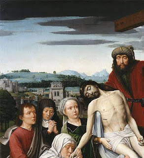
Let us return to the Living Hall and the space the St. Francis usually occupies. In its place is The Disposition by the Netherlandish painter, Gerard David (c. 1460-1523). The scene is Christ’s removal from the cross after His death. Joseph of Arimathea, who received permission to remove the body, is seen with Christ’s other followers along with the Virgin Mary, St. John the Evangelist and Mary Magdalene. The work was acquired by Frick the same year, in the same lot and from same collector as Bellini’s St. Francis.
Gerard David, Detail of The Disposition, c. 1495-1500,
oil on linen (mounted on mahogany panel),
56 1/8 x 44 1/4 in. (142.5 x 112.4 cm),
The Frick Collection, New York
Photo: ARTstor

Gerard David, Detail of The Disposition, c. 1495-1500,
oil on linen (mounted on mahogany panel),
56 1/8 x 44 1/4 in. (142.5 x 112.4 cm),
The Frick Collection, New York
Photo: ARTstor

Although The Disposition was painted about a century after the St. Francis, like the earlier work, the background contains a careful and precise naturalistic townscape with a variety of finely delineated structures. There are castles, towers, fortified walls, a church and windmill. Frick is known to have had a predilection for landscape paintings and this may account for his attraction to the work. Furthermore, there is a prominent skull at the foot of the cross. Although the skull denotes Calvary, the site of the Crucifixion, it has also long been a symbol of the transitory nature of earthly life, a reminder of mortality. Perhaps, in his late sixties, Frick had thoughts of his own end. Whatever the reasons for the purchase, we are lucky to have the David and, of course, the Bellini in New York for us to enjoy.

Note: The Frick has opened a Multimedia Room off to one side of the Garden Court where visitors may view videos on specific aspects of Bellini’s St. Francis in the Desert and look closely at the infrared photograph of the work’s underdrawing. The videos and related lectures are accessible on the museum’s Web site along with a link to the painting's Google Art Project gigapixal image. Susannah Rutherglen, The Frick's Andrew W. Mellon Curatorial Fellow, is responsible for the coordination of this extraordinary exhibit and deserves much acclaim.

In a New Light: Bellini's St. Francis in the Desert
May 22, 2011, through August 28, 2011
1 East 70th Street, Manhattan

Tuesday through Saturday, 10:00 a.m. to 6:00 p.m.
Sundays, 11:00 a.m. to 5:00 p.m.
Closed Mondays and holidays

Thursday, June 30, 2011

A Radiant Masterpiece Reveals More: Part 1


Giovanni Bellini, St. Francis in the Desert, c. 1480,
oil on poplar panel, 49 x 55 7⁄8 in. (124.5 x 141.9 cm),
Photo: Michael Bodycomb

The Frick Collection’s St. Francis in the Desert by Giovanni Bellini was sent for technical analysis in March, 2010 to the Sherman Fairchild Paintings Conservation Center of The Metropolitan Museum of Art. This was the first time the work left the museum since it was purchased in 1915. Like other pictures acquired by Henry Clay Frick (1849 - 1919), it can never be loaned.

The work has always been in very good condition but advanced forms of physical analysis presented the opportunity to significantly increase the understanding of Bellini’s working methods and offer clues to the interpretation of the painting. Scholars have long debated its meaning because Bellini’s depiction of St. Francis’ stigmatization is like no other in the history of art. There is even the question if the work indeed describes the saint receiving the stigmata. Art historians have generally entitled the painting St. Francis in Ecstasy.

In a New Light: Bellini's St. Francis in the Desert, The Frick’s current exhibition, presents the results of The Metropolitan Museum’s examination. For the duration of the show, the painting has been moved from the Living Hall, where Frick had placed it, to the Oval Room. This skylighted gallery provides a light-filled space and seating which gives visitors a comfortable place for contemplation. To further enhance viewing, the painting is installed at a height lower than its usual position.

In order to adequately discuss the new information about the painting, I have divided my blog essay into two parts. The first part will deal with the painter, his milieu, the painting’s history, the subject matter, working methods, and some of the recent discoveries. The second part will focus on additional revelations, treatment of the work and its connection to another Frick Collection painting.

We begin.

The St. Francis in the Desert is one of the most beloved pictures in The Frick and is considered by many to be the best Renaissance painting in America. It was one of Henry Clay Frick’s five favorite works. For those interested, the others were: Rembrandt’s Self-Portrait and Polish Rider, Holbein’s Sir Thomas More and Vermeer’s Mistress and Maid.

Frick preferred portraits and landscapes. He had little interest in religious scenes which is not surprising as he was a Protestant. His tastes were actually typical of American collectors of the period. The St. Francis, actually, may be viewed as a landscape painting. The saint and his humble makeshift cloister take up less than one quarter of the work’s surface. The painting is dominated by a precise, botanically correct, depiction of nature with a background townscape that is one of the earliest, if not the first, naturalistic cityscape depiction in Western art. It is easy to overlook that a miracle has or is occurring.

The painter, Giovanni Bellini (c. 1430 - 1516), is regarded as the artist who brought Venice to the High Renaissance. Visiting the city for the second time in 1506, Albrecht Dürer, described him as the best painter there. Bellini came from an eminent family of painters. He began his career in the studio of his father, Jacopo Bellini. Jacopo was known for extraordinary inventive works and was considered at that time, Venice’s most important painter. Giovanni Bellini’s older brother, Gentile, was held in such esteem that the Venetian Republic sent him to the Ottoman Court of Constantinople as their visiting painter. Bellini’s cousin Leonardo Bellini excelled in manuscript illumination. His brother-in-law was Andrea Mantegna whose figurative style and spatial illusionism surpassed all peers. Mantegna had an enormous influence on Bellini’s development.

In early fifteenth-century Venice, egg tempera was the painting method of choice. This is a quick-drying paint requiring meticulous preparation. Bellini trained in his father’s workshop with this technique. During this period, oil was a fairly original way of painting used primarily by Netherlandish and Flemish artists. As a slow-drying medium, oil allowed for many effects in rendering forms realistically and was capable of producing brilliant colors. Bellini, aware of the northern artists' achievements, learned more from the Sicilian painter Antonello da Messina who was in Venice from 1475 to 1476. Antonello’s proficiency has been attributed to his contact with Flemish artists visiting Sicily and his scrutiny of a work by Jan van Eyck which he saw in Naples. Be that as it may, Bellini took to this method, exploited its potential and created a style characterized by formal clarity, fervor for details and a vision saturated with light. He is credited with having a key role in changing the predominant painting medium in Venice from egg tempera to oil. This, of course, had wondrous repercussions, especially on Bellini’s students, Titian and Giorgione.

The Frick St. Francis was painted entirely in oil. Little is known about the work’s origins. Such questions as “Why it was painted?”, “For whom it was painted?”, “Where was it initially located?”, have not been answered. We know that it was in a private collection in a Venetian home some forty to fifty years after completion. Historians have suggested that the painting may have been intended for a chapel on a monastic island associated with St. Francis but no document has been found to confirm its earliest provenance.

St. Francis, a thirteenth-century saint, was enormously popular in Venice. He was the son of a wealthy cloth merchant, who renounced his worldly life after receiving a vision. He lived a life of poverty, preached the Gospel in Italy and overseas, and founded the Franciscan Order. He was the first person to receive the stigmata, Christ’s five crucifixion wounds symbolizing the divine’s recognition of steadfast faith. This momentous event took place in 1224 during the saint’s fast on the Tuscan mountain of La Verna. His follower, Brother Leo, had accompanied him and witnessed the stigmatization. Leo described Christ in the form of a fiery seraph, one of the angelic higher orders, with six wings who flew on a cross transmitting the wounds to St. Francis.

Paintings that depict St. Francis usually represent him kneeling while receiving the stigmata via rays sent forth from a airborne seraph on a crucifix. The beams pierce his hands, feet and side. Some scholars have hypothesized that The Frick St. Francis may have had a seraph painted in the upper part of the painting but was lost when the work was cut down. Analysis, however, determined only a few centimeters were removed from the top panel. Considered too small an amount to have contained figures, it was concluded the seraph most likely was never there. Further technical study using high magnification, microscopic examination, X-rays, infrared reflectography, paint analysis, surface inspection and study/discussions by conservators, art historians, scientists and educators revealed more.

X-rays established that Bellini used three horizontal poplar panels as the painting’s support. These were prepared with a gesso ground made from gypsum and animal glue. Bellini then carefully delineated an underdrawing using fluid, carbon-based black paint. In a few places he incised the drawing with the reverse end of his brush, such as in the shadow of the saint. After the underdrawing dried, assistants spread a preliminary layer of oil mixed with a little lead white. This mixture produced a bright reflective surface that did not obscure the underdrawing. It had several functions: it imparted luminosity to the overlying paint and gave the effect of light seeming to emanate from the painting’s interior; it acted as a sealant for the underlying drawing; and, it insulated the painting by preventing the oil paint’s seepage into the porous ground below. Since the oil/lead white layer was smoothed by hand, paint loss has now exposed finger and palm prints in certain areas. None were Bellini's.


Giovanni Bellini, Detail of St. Francis in the Desert, c. 1480,
oil on poplar panel, 49 x 55 7⁄8 in. (124.5 x 141.9 cm),
Photo: Michael Bodycomb

The question of whether the saint had stigmata was long debated. Some people thought the stigmata on his hands were a nineteenth-century addition. The stigma on his foot is not visible to the unaided eye. During The Metropolitan Museum’s study, an infrared reflectogram produced a black-and-white clear image of Bellini’s underdrawing. For the first time, scholars could study the artist’s preparatory composition. It distinctly showed that the stigmata on the saint’s hands and the stigma on his left foot were originally depicted. In addition, residue of red paint on the foot was discerned using high magnification. The paint had worn away but the wound mark had certainly been indicated by the artist.

Bellini choose not to depict St. Francis in the conventional manner. The saint has no side wound. He is marked only on his hands and left foot. Brother Leo, who is typically present, is not there. In fact, the stigmatization seems not to be the most important meaning of the painting. Additional analysis provides further clarification. For now, however, visit the painting. My next post will tell more.

In a New Light: Bellini's St. Francis in the Desert

May 22, 2011, through August 28, 2011
1 East 70th Street, Manhattan

Tuesday through Saturday, 10:00 a.m. to 6:00 p.m.
Sundays, 11:00 a.m. to 5:00 p.m.
Closed Mondays and holidays

Saturday, May 21, 2011

A Fred and Ginger of the Art World:  Sol LeWitt and Eva Hesse


Eva Hesse,
Accession V, 1968, 
galvanized steel and rubber, 10 x 10 x 10 in. (25.4 x 25.4 x 25.4 cm),
Courtesy of the Craig F. Starr Gallery, New York


Sol LeWitt,
3 × 3 × 3, 1965,
painted wood, 14 1⁄2 x 14 1⁄2 × 14 1⁄2 in. (36.8 x 36.8 x 36.8 cm),
signed and dated underneath: ‘Sol LeWitt 1965’,
Courtesy of Craig F. Starr Gallery, New York


Eva Hesse and Sol LeWitt, a museum-worthy exhibit, is now on view at the Craig F. Starr Gallery. Rather than stressing the artists’ differences, the show highlights their mutual influences especially the impact Hesse had on LeWitt. I can think of no exhibition in the past that has shown the longterm effect Hesse’s art had on the work of LeWitt.

Veronica Roberts, Director of Research for the Sol LeWitt Wall Drawing Catalogue Raisonné and Adjunct Associate Curator of Contemporary Art at the Indianapolis Museum of Art, curated the show and wrote the essay for the exhibition’s catalogue. Roberts has done an inspiring job in the choice of works and their placement which illuminates each artist's achievement in an informal, intimate manner.

LeWitt met Hesse in 1960 and remained friends until her death ten years later. They were part of a group of artists working in lower Manhattan who formed strong bonds while creating new stylistic movements.

LeWitt had much confidence in Hesse's abilities while she suffered with insecurities and anxieties. The exhibition includes a reproduction of a letter LeWitt wrote to Hesse in 1965 when she was in Germany for a fourteen month residency with her husband Tom Doyle. He urged her to “DO” her art and offered strong support and insight into her struggles. He wrote, “Well, you know I admire your work greatly and can’t understand why you are so bothered by it.” LeWitt continued, ”You also must believe in your ability.”  Further he encouraged, “You have at your power the ability to do anything.” Such was his friendship and caring.

Hesse took the minimalist ideas further and evolved what is referred to as a post-minimalism style. The austere, modular, geometric forms of such artists as LeWitt were transformed into something personal and anti-form.   Her work was sensual, erotically charged with illusions to the human body.  LeWitt responded. The teacher/mentor was taught by the pupil. His artwork changed.


Sol LeWitt, 
Horizontal Brushstrokes (More or Less), 2002,
gouache on paper, 22 3/8 x 22 3/8 in. (56.8 x 56.8 cm),
signed and dated lower right: ‘S LeWitt 02’,
Courtesy of the Craig F. Starr Gallery, New York


Eva Hesse,
No title, 1966,
enamel, cord, papier-caché, latex, and rubber,
47 x 11 1⁄2 x 2 1⁄2 in. (119.4 x 29.2 x 6.4 cm),
Courtesy of Craig F. Starr Gallery, New York


To paraphrase what is often said of the Fred Astaire and Ginger Rogers partnership, one can say LeWitt gave Hesse classic structure and she gave him sexuality. Frank Gehry understood such relationships when he designed the Fred and Ginger building in Prague.

Frank Gehry, Fred and Ginger House, 1992-1996,
Prague, Czeck Republic

Don't miss the Hesse and LeWitt show.

Eva Hesse and Sol LeWitt
April 12 - May 27
5 East 73rd Street, Manhattan
Tuesday - Saturday
 11 am to 5:30 pm


Wednesday, May 18, 2011

An Eyeful Treat - Looking Close At Caravaggio


Michelangelo Merisi da Caravaggio,
The Fortune Teller, c. 1594,
oil on canvas, 45 x 59 in. (115 x 150 cm),
Musei Capitolini, Rome, Italy

Something rare has arrived in New York. Michelangelo Merisi da Caravaggio’s La Buona Ventura (The Fortune Teller) from the Musei Capitolini, Rome, is on exhibit for five days at the Italian Cultural Institute. It is displayed in room by itself, well-lit, with no protecting glass. You can look without glare or any distortion which sometimes occurs when viewing through so-called transparent coverings. It appears in good condition having been cleaned and restored in Italy about a year and a half ago. Close, concentrated observation illuminates details that are often overlooked in a venue that may have other painterly distractions.

Michelangelo Merisi da Caravaggio,
The Cardsharps, c. 1594,
oil on canvas, 37 1/8 x 51 5/8 in. (94.2 x 130.9 cm),
Kimball Art Museum, Fort Worth, Texas

The Fortune Teller, c. 1594, is one of the painter’s early works. Caravaggio, just starting out on his own, needed money and sold it for a small amount. The painting became part of the collection of the Roman banker and connoisseur, Marchese Vincente Giustiniani. The banker’s friend, Cardinal Francesco Maria del Monte, purchased the painting’s companion piece, The Cardsharps. These two paintings were very popular and copies were made.


Michelangelo Merisi da Caravaggio,
The Fortune Teller, c. 1595,
oil on canvas, 37 x 52 in. (99 x 131 cm),
Musée du Louvre, Paris, France

Caravaggio’s new subject matter and precise observation of nature had a significant impact on other artists working in Rome where the artificial style of Mannerism was prevalent. Giustiniani and Cardinal del Monte became important patrons of the artist. The Cardinal going so far as to provide the painter quarters in his palace. The artist made him a second version of The Fortune Teller, now in the Musée du Louvre, Paris, France.

The Musei Capitolini Fortune Teller is one of Caravaggio’s most influential works. The painting depicts a gypsy girl reading the palm of a dandyish young man. The boy stares into the girl’s face, unaware she is slipping off his ring while stroking his palm. You must look closely at youth's ring finger between her little and fourth digit to discern his gold band.


Michelangelo Merisi da Caravaggio,
The Fortune Teller (Detail), c. 1594,
oil on canvas, 45 x 59 in. (115 x 150 cm),
Musei Capitolini, Rome, Italy

Of particular interest is the realistic manner in which Caravaggio rendered textures: feathers, leather, metal, and a variety of cloths are differentiated with veracity.


Michelangelo Merisi da Caravaggio,
The Fortune Teller (Detail), c. 1594,
oil on canvas, 45 x 59 in. (115 x 150 cm),
Musei Capitolini, Rome, Italy

The juxtaposition of the fabrics on the young man’s torso is a celebration of the artist’s skillfulness. Clearly denoted are the tactile qualities of the linen shirt undergarment with its embroidered lace cuffs, the heavy brocade upper costume with its velvety decorative stripes and the coarser dark cloak draped over his right shoulder. At the meeting of the girl’s left and the boy’s right wrist, Caravaggio distinguishes between the whites and materials of her blouse and his shirt.


Michelangelo Merisi da Caravaggio,
The Fortune Teller (Detail), c. 1594,
oil on canvas, 45 x 59 in. (115 x 150 cm),
Musei Capitolini, Rome, Italy

There is delight in treatment of the gypsy’s hair especially the wayward strands that stand out against the white of her turban and those alongside her left cheek.


Michelangelo Merisi da Caravaggio,
The Fortune Teller (Detail), c. 1594,
oil on canvas, 45 x 59 in. (115 x 150 cm),
Musei Capitolini, Rome, Italy

Caravaggio is reported to have selected the model for the gypsy girl from someone who passed him on the street. Her dirty fingernails seem true to life as do the boy’s clean and well-attended ones. Her ruddy complexion contrasts with his paler skin tones - no street work for him. His sword appears capable of being used with its glossy rounded pommel, clothed grip and circular guard. Gloves are conveniently tucked away for safe keeping in the guard’s cross bar.


Michelangelo Merisi da Caravaggio,
The Fortune Teller (Detail), c. 1594,
oil on canvas, 45 x 59 in. (115 x 150 cm),
Musei Capitolini, Rome, Italy

It seemed Caravaggio took much care with the placement of the young man’s left hand on his hip, drawing attention to the sheen on the adjacent belt fastener. The lace embroidered cuffs of young man’s costume are the only fussiness in the work. Compare this with the delicate, fine description of the slender ties closing his shirt’s collar as well as the girl’s neck bow and decorative neckline.


Michelangelo Merisi da Caravaggio,
The Fortune Teller (Detail), c. 1594,
oil on canvas, 45 x 59 in. (115 x 150 cm),
Musei Capitolini, Rome, Italy


Michelangelo Merisi da Caravaggio,
The Fortune Teller (Detail), c. 1594,
oil on canvas, 45 x 59 in. (115 x 150 cm),
Musei Capitolini, Rome, Italy

Of further note are the superbly realized folds of the girl’s blouse and the flamboyant, puffy left sleeve of the young man’s outer garment. There is special beauty in the passage where the fabric of the girl’s left sleeve falls gently over her apron as she leans to her right.

The point of this is to remind the reader that you do not need a blockbuster show to learn. Spending undisturbed time with one painting will yield much. You concentrate on looking and that is what the pleasure of art is about. I heard one viewer say standing in front of the work, “I feel like I am in bed with it.” That’s about as close and intimate as you can get.


A Buona Ventura, Caravaggio’s The Fortune Teller: A Masterpiece From Musei Capitolini, Rome
May 11 through May 15, 2011
686 Park Avenue, Manhattan, New York
Weekdays 10 am to 6 pm
Saturday and Sunday 11 am to 6 pm

The Fortune Teller Travels
After New York, The Fortune Teller travels to the Speed Museum in Louisville, Kentucky, where, from May 18 through June 5, it will be the focal point of an exhibit focusing on Caravaggio’s influence on seventeenth-century Italian, Netherlandish and Flemish artists. From June 17 through September 11, 2011, the painting can be seen at the National Gallery of Canada, Ottawa, in the exhibition, “Caravaggio and His Followers in Rome” organized with the Kimbell Art Museum, Fort Worth, Texas. The show, which consists of about 60 paintings, then goes to the Kimbell Art Museum from October 16, 2010 through January 8, 2012.

Friday, April 15, 2011

The Spectacular Design of The Red and White Quilt Show

Infinite Variety: Three Centuries of Red and White Quilts,
Park Avenue Armory, March 25-30, 2011, Installation View

The unrivaled success of the exhibition INFINITE VARIETY: Three Centuries of Red and White Quilts can be attributed not only to the quilts but also to the outstanding installation by the New York City design firm, Thinc Design. The show was on view for only six days, March 25-30, in the Drill Hall of the Park Avenue Armory. For those who were lucky enough to see it, the impact still resonates.

Visitors gasped when they first saw the 651 quilts in the Armory’s vast Hall, some 55,000-square-feet of open expanse under an 80-foot-high barrel vaulted roof. The coverings ranged from 1856, the earliest that could be dated, through the twenty-first century. Most were from the nineteenth century. They appeared weightless, perched high and low as if they could fly. The variety of the bright, clear red and white patterns seemed limitless. They grabbed attention by interacting with each other, the viewing public and the hall’s space. It was an astounding sight. How did this come about?

Artist Unidentified, Vortex Quilt, United States, 1890-1910,
pieced and appliquéd cotton, 80 x 82 in., Collection of Joanna S. Rose,
Photo by Gavin Ashworth

The quilts were from the collection of Joanna S. Rose who has been accumulating American red and white quilts for over fifty years. Her collection numbers more than a thousand. Even though she has no recorded inventory, she has never purchased the same pattern twice. The colorfast nature of the red dyed fabric accounted for the popularity of red and white designs. The red did not run or fade and quilters desired it.

For Mrs. Rose’s eightieth birthday, her husband Daniel Rose, chairman of the real estate development company Rose Associates, asked her want she would like. Mrs. Rose wanted two things: something she had never seen before which was to see all her quilts at once and to give a present to New York City. Working with the American Folk Art Museum, which happens to be celebrating the Year of the Quilt, the Rose family secured the Armory site and made funding available so admission to the exhibit would be free. Mrs. Rose, who participated in every aspect of the show, asked that the display take in the entire collection, make use of the hall’s size and not be too curatorial. She desired people to visually enjoy the quilts. Thinc Design was one of several firms who had submitted proposals.

Infinite Variety: Three Centuries of Red and White Quilts
Park Avenue Armory, March 25-30, 2011, Installation View,
Photo from The Martha Blog

Thinc’s winning scheme centered on a circle of chairs draped with quilts which represented the social circle of women quilters. From this issued a fifty-foot high spiral of quilts signifying a whirlwind of creativity. Six circular pavilions that rose thirty feet surrounded the central gyre. Quilts with bold, strong designs were hung high while those thought to have required a closer look were placed on lower levels. To make possible two-sided views, each quilt was scaled and matched back to back with ones of the same size. Visitors had to go around and inside each hanging circles to see every one. Views changed from the comprehensive - taking it all in - to the intimate - examining in detail an individual piece. The quilts appeared as if nothing held them up, an effect that was achieved by an inventive use of cardboard tubing and cable supports to create the large structures. About a dozen notable bedcovers were showcased on one side and, at the back of the Drill Hall, a wall of hanging quilts acted as a backdrop to the entire show.

Infinite Variety: Three Centuries of Red and White Quilts
Park Avenue Armory, March 25-30, 2011,
Installation Entranceway View,
Photo from The Martha Blog

The exhibition also included a cafe, gift shop and strategically placed curved seating that allowed visitors to rest, absorb everything before them or to exchange thoughts with others. Apart from a short introductory text on a large podium at the entranceway, there wasn’t much explanatory material. The show’s emphasis on visual experience may have accounted for the paucity of description but not much is known about many if not most of the quilts. They were made by common folk for a utilitarian purpose not created as high art destined for museums.

Infinite Variety: Three Centuries of Red and White Quilts,
Park Avenue Armory, March 25-30, 2011, Installation View

Although the coverings were amazing, it was the achievement of the display that elicited the visitors unqualified positive responses. This was the design firm’s accomplishment. According to Tom Hennes, Principal and Founder of Thinc Design and whose grandmother made quilts, about a half dozen people initially worked on the conception. They would meet, discuss, go their respective ways and come back to exchange ideas again. Central to their approach was collaboration and innovation - to think about artworks and exhibits in new ways. Sherri Wasserman, Thinc Design Strategist and whose mother happens to be a quilter, came up with the idea of a quilting circle and the use of repeated circular elements. This led to the project’s extraordinary final design.

For those who missed Infinite Variety: Three Centuries of Red and White Quilts, the American Folk Art Museum hopes to have the show travel and will publish a illustrated catalog within the next two years.

Forthcoming are more projects by Thinc Design. The firm is the lead designer with Local Projects for the Memorial Museum exhibitions at the National September 11 Memorial & Museum, scheduled to open next year.

Wednesday, March 23, 2011

Art Historian Leo Steinberg (1920 - 2011)


Leo Steinberg

Photograph by Pamela Blackwell

Leo Steinberg, the eminent art historian, died Sunday, March 13, 2011. I was one of his students in the early 1970s. He mentored my master thesis. We became and remained friends.

It is difficult to describe such an extraordinary man. I go to the internet. A google search, “Leo Steinberg obiturary”, brings forth pages of online references. Undaunted, I begin to explore. After double-digit reviewing, my thoughts wander to one of Steinberg’s habits. He read The New York Review of Books and would enjoy grading contributors’s essays: a “C+” here, a “A-” there, some “B”s. Similarly, I rate my readings. I can almost hear Steinberg’s distinctive voice: “B”, “A”, definitely “C”. I think he would have been entertained by the exercise. Thus, here are few comments along with the hyperlinks to three of the commemorative ruminations this writer deems “A” or better.

I begin with the traditional style obituary, “Leo Steinberg, Art Historian, Dies at 90”, by Ken Johnson, art critic and writer for the arts pages of The New York Times. This is a thorough, well-informed introduction to Steinberg’s achievements. I have two additions:

(1) Steinberg was a 1984 National Book Critics Circle Award criticism finalist for The Sexuality of Christ in Renaissance Art and in Modern Oblivion (Pantheon)*;

(2) Steinberg was a recipient of the MacArthur Fellowship, also known as the genius award, in 1986.

Next is the more personal words of Gary Schwartz, an art historian specializing in seventeenth-century Dutch art and a good friend of Steinberg. His insightful remarks, “Leo Steinberg (1920-2011)”, are a lesson in art criticism. Schwartz includes a wonderful account of the way Steinberg went about looking at a work of art and points out how his writings have significance not only for the study of art history but for all the humanities.

Last is Fred Sanders’s “Leo Steinberg Looked at Art”. Sanders, a Protestant theologian, focuses on Steinberg’s explanation of the Christ figure in Leonardo da Vinci’s Last Supper. This straightforward essay makes lucid Steinberg’s exhaustive interpretative methodology.

Alas, I am unable to pass on what I consider the best eulogy. At the memorial service, Shelia Schwartz, Steinberg’s assistant for over forty years, read a letter from a former student. This was written by Kevin Salatino, Director of the Bowdoin College Museum of Art. The letter expresses eloquently how the mentorship of Leo Steinberg changed his life and permanently altered it for the better. Salatino articulated the thoughts of many.

In numerous ways Leo Steinberg is irreplaceable. His knowledge was catholic. His verbal and written communicative abilities were exceptional. His curiosity and intellect were without peer. His intelligence had magnanimity. His humanity was profound. His wit was ever present. His teaching had warmth and generosity. His friendship was non-judgmental, accepting. With Steinberg, no subject was too insignificant or proscriptive for discussion and analysis. He enriched the world with his thoughts and reflections. His contributions to art history and human understanding will always be remembered.

*Note 2nd edition: The Sexuality of Christ in Renaissance Art and in Modern Oblivion. Second Edition, Revised and Expanded. Chicago: The University of Chicago Press, 1966.